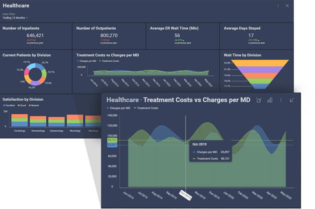
Let’s delve deeper into the world of data visualization! Have you ever found yourself feeling overwhelmed by the sheer volume of numbers on a spreadsheet? Data can be daunting if it is presented poorly, which is where data visualization comes in. It acts as a lifeguard, transforming complex information into clear and understandable visuals.
Consider this scenario: you’re having a conversation with a colleague, and you want to explain a trend. You could describe it using numbers, but wouldn’t it be easier to show them a graph? Our brains are designed to process visuals quickly. A well-crafted chart can instantly reveal patterns, trends, and outliers that might be hidden in pages of data.
Effective data visualization is crucial for several reasons:
1. Clarity and Focus: Charts and graphs help cut through the clutter. They highlight the key message you want to convey, allowing viewers to understand the information without getting bogged down in details. This saves time and helps prevent confusion.
2. Improved Decision-Making: Visualizing data helps you spot trends and relationships that might be missed in raw numbers. This empowers you to make informed decisions based on the bigger picture. By looking at data in a more visual way, you can discover insights that might be missed when looking at it in a spreadsheet.
3. Enhanced Communication: Visuals are a universal language. A well-crafted chart can effectively communicate complex ideas to both technical and non-technical audiences. This improves understanding and encourages everyone to be on the same page.
4. Audience Engagement: Tables full of numbers are tedious. Interactive dashboards and visually appealing charts can grab attention and keep people interested in the information. This helps people stay engaged and interested in what you’re presenting.
So, how do you create effective data visualizations? Here are some key points:
1. Know your audience: Tailor the visuals to their level of understanding. Avoid technical jargon and overly complex charts for non-specialist viewers. Consider their needs and present the data in a way that is most useful to them.
2. Focus on a single message: Avoid overloading your chart with too much information. Each visualization should have a clear and concise purpose. Highlight the most important data and use visuals to support your message.
3. Choose the right chart type: There are many different charts available, each suited for specific purposes. Bar charts are great for comparisons, line charts show trends over time, and pie charts depict parts of a whole. Choose the chart type that best suits the data you want to present.
4. Simplicity is key: Keep the design clean and uncluttered. Use clear labels, consistent formatting, and a limited color palette for better readability. Avoid any unnecessary elements that could distract from the data you’re presenting.
By following these principles, you can transform your data from a confusing jumble into an informative and engaging story. Remember, data visualization is a powerful tool for communication and can significantly enhance your ability to extract insights and make data-driven decisions.
Join leading companies who trust Dateo to bridge the gap between challenges and opportunities. Visit www.dateo.org to see how we can transform your business.

Johnson Smith
Johnson, our CFO, leads with a vision, shaping our service line’s message and direction. Under his guidance, we deliver transformative analytics solutions for our clients. When he’s off the clock, Johnson recharges with family, running, and the beat of live music.

